
Synthesis
Improving the pricing rule-writing experience for the inventory management system
Background
FusionZone services over 1,500 websites and over 1,000 dealers in the USA. As a fast-growing company, we face a range of challenges to keep our profit margin healthy. One of the most significant challenges is to reduce our operating costs, which are increasing.
We spend over $1 million dollars a year on outsourcing our inventory management system service. We looked at our current inventory management processes and identified that they are inefficient and had incurred high labor cost.
FusionZone decided to build its own powerful system, Synthesis, to lower the operating costs.
Cost-cutting Strategies:
-
Cutting production costs — Using our own inventory management system,Synthesis.
-
Lower labor costs — Allowing client service to do some of the programmers’ works.
-
Increase work efficiency —Building new features and technology to automate repetitive works.

Role
I’ve been leading this UX design project from concept to implementation. I was in the design cycle behind every iteration, and worked with a cross-function team. In the end, I coded my design with HTML/CSS, Bootstrap, NodeJS, ReactJS, ES6, and gitlab.
-
Research
Who are the users? What is the product? What are the goals? What are the pain points?
2. Brainstorming ideas
3. Collaborate with a cross-function team
Users, stakeholders, devs and engineers.
4. Create an early low-fi design
5. Iterate & test
User test where possible.
6. Create html/css/NodeJS/ReactJS/ES6/gitlab with engineers
7. Iterate & test
User test where possible.
8. Hand over the implementation
What was I asked to do?
-
Improve the overall look of synthesis.
-
Apply a user-centered design approach to an intuitive and usable new design for the users with no technical background and get it implemented.
What did I inherit?
A super complex interface full of engineering jargon, coded in tables and it was not very pretty! I will showcase what I did to improve the Pricing Rule Builder section.

An Important piece of synthesis is “Pricing rule builder”. The user can set up complex conditions and run custom price calculations. It was a challenge to make users with no technical background capable of using it intuitively. I’ve spent a good amount of time on improving the user experience and testing all the changes.
It was a challenge to make users with no technical background intuitively understand how to set up complex conditions and price calculations.
Research
What is synthesis? How does it work? Is there a document? A diagram? I need to talk to engineers, developers and client services.

Usability testing
In order to get more insights into how users understand and interact with this tool, I conducted a usability test with 6 users (3 developers and 3 client services). They were asked to write and test pricing rule:
"Take 200 off of MSRP and set as the best pice for the 2018 Honda civic and the 2018 Honda accord"
"I have no clue how to use this tool to set up this pricing rule. What is integer, float and string mean?"

- Client service
Goal and measurement
After gaining insights from the interview and the interface evaluation, the first thing I did was work on creating a goal and measurable plan. I found the framework from Google's research team to be a very useful tool to measure the user experience.
My goal is that the user can quickly define and test the price rule in 5-8 minutes with 90% accuracy.

Ideate
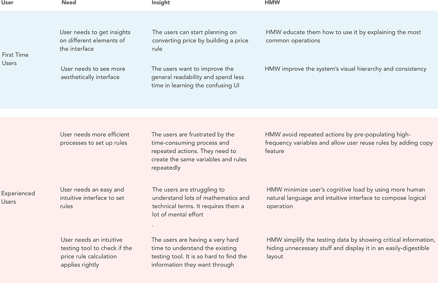
Inspired by Rikke Dam’s POV & HMW framework, I created POV by combining users, needs and insights and generated HMW according to POV. It turns out to be very helpful to define and frame my design challenge. Following are the key design challenges.
Key Challenges
-
Improve the overall visual hierarchy and consistency
-
Minimize repeated actions
-
Replace technical terms with human natural language
-
Intuitive interface to compose logical operations for non-technical users
-
Improve testing tool user experience and make it easy to digest
Redesign
Following user experience design principles, each design was repeatedly evaluated and iterated. This led to the development of an intuitive interface that makes the rule builder experience more engaged and gets you more familiarized in no time. Here are some key design improvements that are worth highlighting:
1.Quicker and more efficient setup process
My first and most important goal is to help the user avoid repeated actions. I learned from the previous design that the users have to manually create over 18 variables repeatedly for each car dealership. In order to minimize repeated actions, I created pre-populating common pricing variables which can save users tons of time. I added a copy feature for the rule user who wants to re-use again. Now the feature saves users time with just one click.
Before

After

1. Pre-populating all the common use variables. improving work efficiency.
2. An easy and intuitive way to show where variables are pulled from and saved without an extra click.
3. Don't force user to define data type every time.
4. Users can now duplicate rules with a single click.
2. Intuitive and scalable price rule builder
This rule builder section was the most frustrating and confusing step in the process. We did not want the users to spend over 15 minutes here to write a simple rule. The overcomplicated drop-down list and the ambiguous interface make users find simple tasks complicated and their decision-making difficult.
The new design saves time by shortening the drop-down list and writing it in a concise and non-technical language that everyone can understand. The intuitive and scalable rule builder now not only supports writing rules easily but also adds nesting rules features which are more powerful. It could save more time and is more efficient.
Before

After
-
concise and user-friendly dropdown lists.

2. Intuitive interface with a powerful nesting rule feature.
3. Keep calm and get informed
We learned that client service people had no clue how to read the test result messages. Developers have to find results through a hundred lines of test logs. With the new design, you can check how the price rules are affecting the vehicle’s price at a glance.
Before

After

Iteration
Following user experience design principles, each design was repeatedly evaluated and iterated. With each iteration, I improved the design based on the findings during user interview and feedback from CTO and engineers. Below I want to share one of my iteration examples.
This is the old design where the user can check if the price rule applies correctly or not. As you can see, test messages are overcomplicated and contain a lot of technical terms. This message might explain the problem from a developer’s perspective but it will leave our client service user with more questions than answers.
How to paraphrase these technical details into a simple and plain language without referring to implementation details?

Old design with lots of irrelevant information and technical terms
1. Be short and relevant
Most of the time, the user is not willing to read a long story. I read through the test implementation details. I found out that after the user runs the test, it starts to check all the variables and then checks all the price rules by orders under that account even though they are not relevant to that car. That is why it was so long and complex.
The test panel should be an at-a-glance preview of crucial information important for the user. My first iteration is to only show variables applied and rule’s errors that are relevant to that car and to use plain language to write error details.

Iteration1: Concise and simple interface with only the relevant information and plain language
2. Be helpful and meaningful
After a few user interviews, I realized that I went in the wrong direction. I was trying so hard to translate the messages to human languages but I didn’t pay attention to what kind of information users expect to see.
The old test result showed variables' initial value which why the final price is 0. This information was meaningless to the users. With the iteration 2 design, I changed it to show the calculated values and I separated price values and other values to help the user find specified values easily.

Iteration 2: Meaningful and helpful calculated price values match the user’s mental model of checking math operation errors
3. There is more
The design resonated well with users. After talking to the engineer about how to implement it, he pointed out a scenario that I haven’t covered. If we only show error messages, we can only detect invalid conditions or operations. However, if the user accidentally inputs a 100 off-selling price instead of 200, it will affect the final price. The system won’t count this as an error. If we can show all the other rules this car applied, the user can find the problem very quickly and simply.
Final design

Measure success
The new design resonated well with CTO and shareholders. We asked users to perform the same task “Take 200 off of MSRP and set as best pice if 2018 Honda civic and 2018 Honda accord“. Below is our success metrics data.
.png)
What I learned
Design for enterprise applications (B2B) is little different from consumer applications (B2C).
-
Enterprise applications are all about the display, manipulation, and storage of large amounts of data. The scale of complexity is generally higher than B2C applications.
-
B2B applications are used to satisfy the needs of an organization and help organizations and their employees to do their work. An enterprise user’s mindset and behavior are quite different from a casual individual user’s. They want to get their work done efficiently. Designing for those working professionals requires a good understanding of their job context, workflow, environment and where they are struggling.
I sincerely thank my CTO and Engineer Lead for giving me this awesome opportunity. I really enjoyed solving all the complex challenges and seeing how my design helps users get their work done efficiently at the end.
View More Works

KushZone (iOS)
UX Design / Research